Saturday, August 28, 2010

Back to my new style

So far I have made three works on thick acrylic paper that were really to my liking and in a new style for me. An addiction may be in the making, 'cause I have made a fourth one. The colors on this one are a little darker than the previous three, but I kind of like the atmosphere this gives.


This one is called "Van deze drie...", which means "Of these three...", it's the age old wisdom that of faith, hope and love , love is the strongest. The words 'faith', 'hope' and 'love' are put in there too, in their dutch translation that is.

I really enjoy these works, because they are a combination of many techniques all piled on top of each other and I got to use some new stamps as well. What more can an artsy girl want?

PS, I notice that when I photograph these works the lens of the camera tends to warp them a little, which makes the paper seem really crooked. I assure you that in real life the paper is nice and straight ;-) If anybody knows a way around this warped effect I would really like to know.

Thursday, August 26, 2010

Some really bad art!

I usually work best without any assignments. In fact things like a given theme or a set of rules can really get me stuck. But...every now and then it is nice to do something someone else tells you to anyway. It's good to get out of the comfort zone. It's good to try something new. It's good just to see what happens when you follow someone elses lead, no matter how little leading they do. It doesn't necessarily mean any good art will get made, so be warned ;-)

This week I did two exercises from two different books.

The first one is a dutch book full of assignments on abstract painting by Rolina van Vliet (Ga abstract : de praktijk). The following is just a simple study on shapes and structures.


I did it with acrylics in a large watercolour sketchbook. The interesting thing in making this was that I used no brushes whatsoever. Just painting knives, a pointy wooden dip pen and my fingers. Making it was really digging in to the paint and that was fun. But after all that effort I think we can safely say it's one of the ugliest things I have ever made and that's a true accomplishment indeed! ;-)

The other book I worked with is one I already showed you an exercise from (remember the cats in bed?). It's "Drawing Lab" by Carla Sonheim. This time I did the second lab which is about blind contour drawing. You are encouraged to draw giraffes. Where does she come up with this stuff? ;-)

I made several pages full of giraffes in all sorts of positions. For those who don't know it: blind contour drawing means you just look at the picture you want to draw after, not at your drawing. You follow the outline of your subject and never take your eyes of it. This means you don't see what's going on on the paper and your drawing ends up a big old mess, but it's supposed to help with learning to really see.

I won't bother you with all the silly giraffe like creatures I made, but I will show you the final page, because I had some extra fun with it. It's from an A4 size simple sketchbook/scrapbook.


The photograph I tried to draw was of a young giraffe bend forward to drink. I made several blind contour drawings of it on this page. What is interesting is that even though the drawings are all warped you can still kind of see they are giraffes. I liked these four together and decided to make a little scenery with them. So I made this field with a fence in the back and a sign that says what creatures they are (I liked the idea of 'blind contour giraffes' as just another type of giraffe) and a warning not to feed them. ;-) I colored everything with gouache.This is what one might call 'silly art' and I actually do like this one.

I think I will work from both books again in the future, so be prepared, you never know what might come up here.

Wednesday, August 25, 2010

Prepping a new journal

My current everyday (mostly writing) journal is nearing it's end. Just about 10 more pages to go and it's done. It's been with me since january. I have not shown pictures of it, mostly because it's not interesting at all to look at. It's just writing with a pasted in picture here and there.

I always get a little sentimental when I finish a journal I've been keeping for a long time (eight months now). When you start a fresh one it's strange and new and unfamiliar, but after a few months it becomes like a steady companion. And then when you finish it's a little like having to say goodbye to a dear friend.

But...there's also the excitement of starting a new journal. I always pick a different kind and sometimes I will prepare it for the coming times and sometimes I just leave it blank. It all depends on my mood and the journal itself.
Over the past couple of weeks I have been preparing my next everyday journal and here it is:


I used one of the cats-in-bed-drawings to put on the cover. The journal is a large moleskine cahier. The paper of this journal is really flimsy and when I say really flimsy I mean REALLY FLIMSY. I don't know why the moleskine people who make such beautiful books allow their cahiers to have such silly flimsy paper. But everything can be fixed, so I have covered all spreads with gesso and now at least they have a little bite and don't shine through anymore.

I may still cover the cover (cover the cover?) with plastic to protect it a little more against wear and tear, because believe me, it will be worn and torn ;-)


I have put some backgrounds in some of the spreads as well, but a lot of them are still blank. The above is a mixture of neocolor watersoluble crayons and gesso. I like how this makes such chalky colors.


The above is a result of  a thing that I do with left over paint. I just scrape the excess off the brush onto a spread and see what happens. In this case I also used the lid of a glue stick to make circles into the wet paint. Sometimes I will also close the book and stamp one side of the page to the other or I will use the pages to print left over paint on foam stamps. Another thing I do is put the pages down on the paper palet that I use and so print the palet on the spread. This gives really nice effects.  Most prepped pages are messy like this.


I guess this can be called the first 'official' spread in my new journal. I made it after I finished the two spreads in the previous post. I had cleared up my table and some of these scraps were still left over and instead of throwing them away I made this simple collage on a background of gesso. I kind of like this sort of work better than the more elaborate work in the ALMBH journal, because it's so direct and simple.

The journal is now just about ready for use. I may still add some things like paper scraps or more colors, but at least it can be used. Now all I have to do is finish my current one and I'm ready to go ;-)

Monday, August 23, 2010

More ALMBH journal

As the previous post proved I am not one to do the same thing over and over again in a row. That's why the ALMBH online class by Kelly Kilmer will probably take me years to really finish. But that's okay. I like working in that square journal every now and then and last weekend was one of those times.


I made two spreads which are basically collage with a little paint and penwork added. Both are devoted to the same theme: the freedom one feels when making art or playing and the constraint that everyday life sometimes asks of us. Hence the name of the above spread. I found this picture of a really rigid lady and one of a pretty leisurely girl in bikini. It wasn't until I put them on the pages that I realised how they were each other's opposites and how they could represent the opposites in my life. So it's one side VERSUS the other. Get it?


The second one is about my longing for more joy as a result of the previous contradiction between work life with its schedules and obligations and my free time with its possible pleasures. I do many things I enjoy, but I wish I had more time to do them. I'm sure just about everybody struggles with this, but I can only feel my own struggle, so that's what's this page is about. Even though there are pretty and happy pictures in it the writing is full of a lot of complaining ;-)

Wednesday, August 18, 2010

Photography

I have always had a hard time choosing. There's a spoiled child inside me who just DOES NOT WANT TO CHOOSE! I am easily bored with just one thing, I need lots and lots of variety. That's probably why I like working on things that are reasonably small and can get done within a limited amount of time. It's probably also why I have so much trouble with bigger projects like the trilogy. Not because they are hard to do, but because they are big to do ;-)


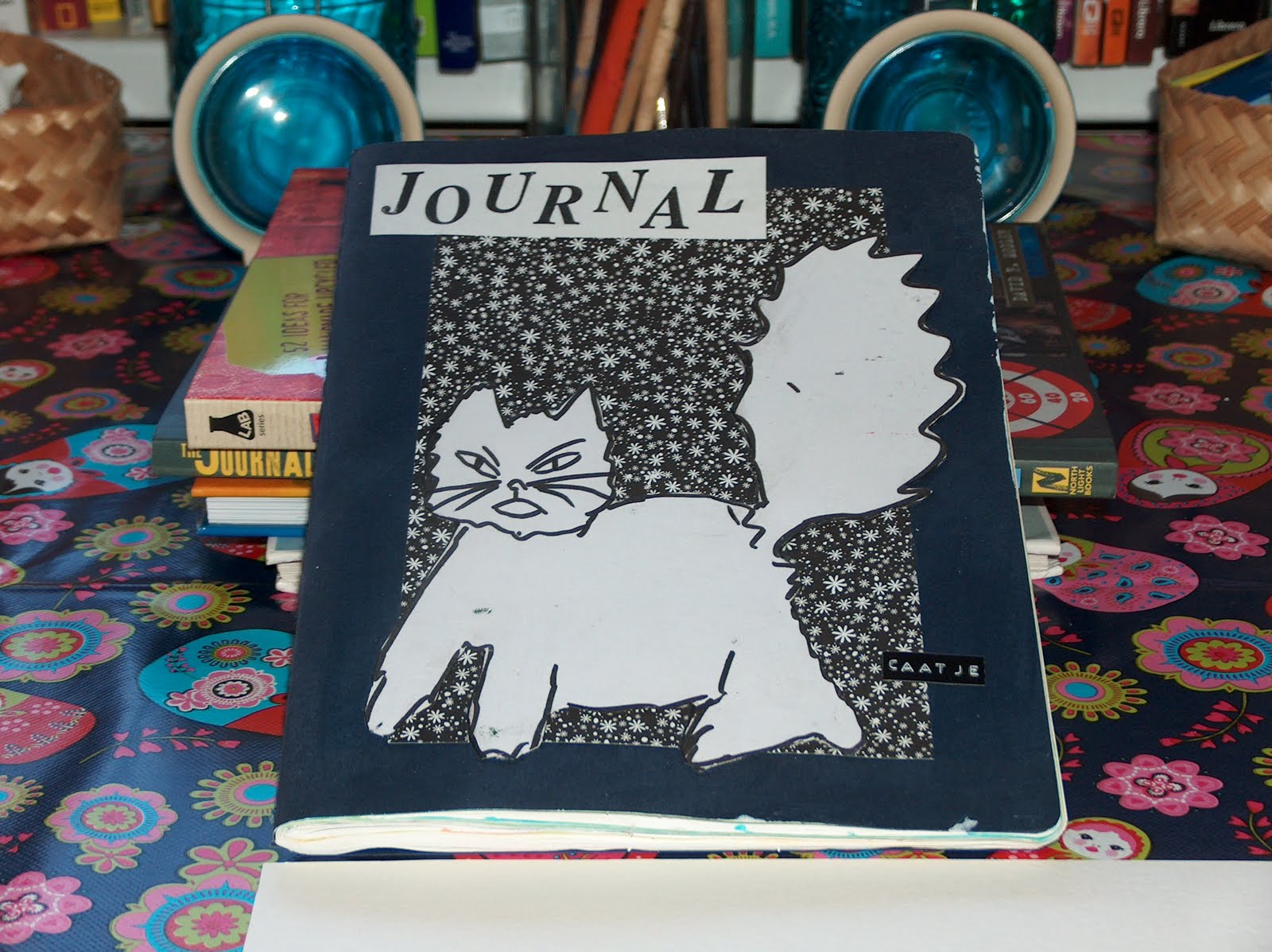
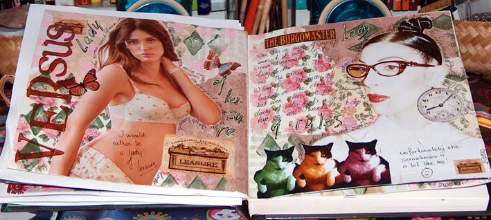
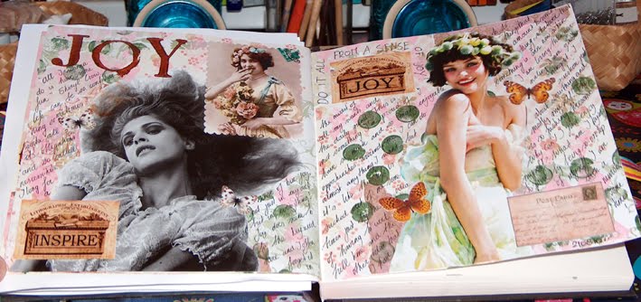
This thing also comes up when it comes to the art forms I like. I cannot just stick with drawing for instance or just paint. I will never be a master who is so skilled in one subject that no one can surpass her. That's just not my way of working. I like things to be broad, wide, full of options and differences. This is why I like so many art forms and why mixed media and art journaling are like a gift from the heavens for me, because what other art form combines my love of so many things onto one small surface? Anything goes. My preference above all preferences is choice itself.


When it comes to artsy expressions there is almost nothing I do not like as long as it's either 2D or the written word. For some reason I cannot do 3D or moving images. I love looking at sculptures and video's, but there is no attraction for me in making them whatsoever. A couple of months ago I took a sculpting workshop and even though it was an interesting experience I knew immediately that is was not my thing.
But other than that: drawing, painting, writing, poetry, collage, mixed media, art journaling, written journaling. You name it, I have done it and still do it.


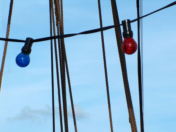
One of my many loves is photography. I am by no means a great photographer and when it comes down to the technical stuff I know next to nothing. However I do seem to have that one thing that makes my pictures turn out alright despite of that: I have an eye for composition and lines. I can hardly call this a skill, it's a simple fact. To me the picture is already there and all I have to do is click the camera button. That's why I don't really consider my photographs art at all, just pictures. But hey, the result can be artsy anyway ;-)


My favorite subjects are landscapes and details/lines that turn a picture almost into an abstract. The pictures in this post are an example of the latter. They were taken about a week ago on board a big sail ship. We went on a small sailing trip south of the island with a big group of coworkers. I took many portraits as well, but for privacy reasons will not show those to you, you'll just have to take my word for it that they turned out nicely.


I especially like the ones of the sails contrasting with the clear blue sky. Those lines, aaah, I'm just in love with them. Please don't ask me to explain, you either get it or you don't ;-)

I put more of these pictures up on my fotothing (where I keep my nicest photographs for all to see), so if you want to see more you can check there, just click here. Enjoy!

Thursday, August 12, 2010

Cat out of bed

After drawing the cats in bed last week I wanted to make at least one cat into a little mixed media piece. There was no way I could do that in bed though, so I went to my studio table instead and tried and tried and finally came to this little work on canvas board.


It started out as a really colorful background that I just couldn't get to work 'right' (whatever that means) so I went over it with these dark colors. Because of this the piece has a whole lot of texture. I painted/drew this white cat over it that was done after one of the cats I drew in bed.  I also put on rub on texts that are all dutch sayings about cats.

I was not too happy with the end result and still can't say I really like it, but that fact did inspire the words on the piece. I got to thinking how cats don't care about what they look like at all, quite the opposite in fact: no matter what they look like they all act as if they are king/queen of the world and there could not possibly be anybody cuter/better/sweeter and more entitled then them ;-)

Maybe we should judge our art the same way or better yet: not judge it at all. It just is what it is. Sometimes we like it, sometimes we don't, that's all part of the process.

Monday, August 9, 2010

Whatever happened to...?

Whatever happened to.... the trilogy?

Well, it's still standing! I just haven't worked on it much. The 'problem' is that I cannot deliver it to its destination (my niece) until half of september when I will probably go visit my sister for her birthday. My intention is to have the trilogy ready then. The problem with me is that this still means that I have more than a month to go before it has to be finished and when I am so full of ideas as I am these days I tend to give priority to other things. But...dear niece...if you're reading this: I promise it will be done half september! To give you just a little look of its current state:


I have been sketching the trees on the canvasses. I used silvercolored neocolor crayons for this. These crayons are watersoluble and will blend well with the silver paint that will go over the sketches. So the trees will turn silver first. Right now you can still see right through them to the background, but that will not be the case after I am done with them. Here's my plan: after the silver paint I will put on a layer of crackle medium. After that comes a layer of buff titan (this is a very off white or very light beige color depending how you look at it). The crackle medium will crack open the white paint and the silver paint underneath will show through these cracks. I have tried this on other pieces and it gives a lovely structure to the trees. What happens after that is still a surprise ;-)

Here's a little close up of the current sketches:


The trees kind of look like tree ghosts right now, haha! But all will be okay, yes it will! ;-)

Whatever happened to.....the second signature journal?

Had a bit of a drama with that one. I have shown the start of it here on this blog. I had finished the cover and the first spread and I had already collaged the rest of the spreads and it was looking pretty good in my humble opinion. Then...my cats thought it would be a great idea to knock over a canister of water all over my work table. It went right over the journal! I was not in the room when it happened so the water had some time to really work it's way in. The thing was soaked, the pages stuck together and some of the images are now torn. The damage is within limits and can probably be fixed or covered up, but I was so bummed out by it that I have put it aside for now and have not found the courage yet to pick it back up. Maybe I should just gesso over it and start again instead. I don't know. For now I'll just leave it until the regret over this mishap is gone.

There, that's all my loose ends for today. Let's get some dinner and then...make some art again!

Sunday, August 8, 2010

Journal art to canvas

It's strange how different substrates can influence your feelings when you're making art. When working on loose pieces of paper the pressure is off and it is just play all the way. As I planned this weekend I made an attempt to move my journal art from paper to canvas. I chose a so called 3D canvas that is 3 cm thick and measures 30x30 cm.

Here's what I came up with (sorry about the glare from the camera flash):


As you can see I used the wooden heart I spoke of earlier, this time no copy!

And to give you a better impression of the painting I'll also show it from an angle so you can see what I did to the sides:


I am quite happy with the result, but what is interesting to me is that I felt much more pressure to perform when working on this canvas than I did with the acrylic paper. I think it's the same thing that some people have with art journaling in really beautiful journals. There seems to be a different feel to a cheap blank book with flimsy paper than to an expensive moleskine for instance. The prettier, the more expensive, the highter the pressure to perform. With blank books I am getting over that hump just fine lately, but when it comes to canvas I still have a lot to learn, or maybe...unlearn?
Why would a canvas feel more important than a piece of paper? I mean, I can tell that one is more expensive than the other and less easily thrown aside, but still...why does it matter? If a canvas does not turn out right I can always gesso over it and use it again, just like with paper I can just get another sheet. Once again: it's all in the mind. Ah, what happy artists we'd be if we could just put our mind aside!

Friday, August 6, 2010

Finished journal art

Well, the piece I started yesterday is finished. I added a lot to it and here is how it looks:


I really enjoyed making it as I did with the other two pieces in this new style. What I also loved was adding the ribbon and lace (have I mentioned how I love ribbon and lace?). It really ads texture and interest. I was thinking to myself afterward that the texts, while meant to be a reference to art and play, could also be interpreted as a brothel commercial ;-) Oh well, to each his/her own, haha. I'm now hoping to make a piece in similar style this weekend on a canvas. I'll let you know if that works out.

Thursday, August 5, 2010

Cats in bed

I recently received Carla Sonheims lovely book "Drawing Lab". It's labeled as a drawing exercise book for mixed media artists. I don't draw much, except for girls. I have not shown many (or any?) on this blog so far, but if you go to my flickr you will find plenty of girls there. I have always drawn girls ever since I was a child, so I suppose it's in my genes. ;-)

I thought it might be interesting to see a book where drawing was not looked upon so...what's the word...precisely (?). I am not really looking for rules and regulations. I have a great admiration for people who can draw things meticulously, but I don't want to be one of them. Drawing, like all art, should just be fun.

So when Carla's first 'lab' asked me to draw 30 cats in bed I just couldn't resist!


Yes, I actually took a sketchbook to bed and drew cats! Really really bad and really really silly cats. It was a blast and it was also harder than I thought, because trying to think up 30 different cats in your head is not as easy as you might assume.


Believe me, I know they are not great drawings at all, but that's so not the point. The point is that these weird looking cats were fun to do and I am thinking about turning one of them into a little painting just for the heck of it. We'll see. Also, one bad drawing is just that: a bad drawing, but a whole collection of them is quite funny to look at.

Another thing I am working is the following piece. Again on paper:


It's not finished yet, but I thought I'd show it to you anyway, 'cause I like the colors so much. As you can see it is still taped to my drawing board. A lot of people seem to be into spray painting these days and looking at all that stuff made me want to bring out some stencils again and also get some new ones. Now, no spray paint was used here. It's mostly regular acrylics and one color of glimmer mist (I don't see it glimmer by the way, did I not shake it well enough?). The base of the piece is neocolor mixed with gesso. It is fun to layer all those things on top of each other. I have already some papers picked out to put over this and I think I will add some ephemera and/or writing as well. I'll show it to you when it's ready.

Tuesday, August 3, 2010

More journal pages

I finished the last of the three spreads I showed as works in progress a while ago. It's interesting how I get these positive responses on the other two spreads I showed yesterday. This just proves to me what I have known for a while: that what we think of our own art has very little to do with what others will think of it. This is simply because we were there for the whole process and all the thoughts and feelings that went with it and the onlooker just sees the finished product or some stages. Even if one were to show the entire making of a spread on youtube, you still would not be able to get inside the head of the artist. I am really fascinated by this idea of onlooker versus artist and how they perceive the work that was made.

Anyway, here's the finished spread:


I like this one the best of the three that I did in this Kelly Kilmer style. It is, just like the other two by the way, not based on any of the prompts that she gave in her online class. It is simply about the thing that is always the hardest for me and that is to surrender to life and whatever it brings. They say you should know the difference between the stuff you cannot change and the stuff you can change and only put your energy in the latter. But...the stuff I cannot change is exactly what drives me up the wall and makes me mad as hell! Well, I never said I was sane. ;-)

After I finished this spread I had a little fun with one of the prompts Kelly did give. For those following the class: it is prompt 13 (no, I am not doing them in the correct order). This is a childhood memory and it shows a not so pleasant part of my personality:


It's about me kicking a little child and not feeling guilty about it at all. In my defence: I was six or seven at the time and the kid was a pain in the ass who just wouldn't let up. He suffered no permanent damage by the way, but I may have wished it upon him at the time. ;-) I am by no means a physically violent person, so the memory has stayed with me all my life.

Apart from the subject I really enjoyed using paint in my journal again. It's a very simple page. The picture of the naughty little boy I found on the internet by searching for...yes...'naughty boy'. As expected these key words also brought on some erotic stuff (of mostly naughty girls by the way, go figure), which made me laugh. Sometimes the internet is just so predictable!

Monday, August 2, 2010

Some work in progress finished

About ten days ago I showed you three spreads that I was working on in my ALMBH journal. Two of them are now finished. I am only moderately pleased with them, but that's mostly because I liked them so much without the journaling. I do not feel I improved on their overall impression. Sigh...


This first one is about life as a dance or a game. I had already started a little journaling when I first posted these pages. I also added some ribbon. I am absolutely in love with all sorts of ribbon and lace and I love putting it in my art. I guess with these pages I am trying to tell myself not to take life too seriously ;-) A thing that's always easier said than done by the way.


I like this one better than the previous one, although I think I should have done my writing in black instead of blue so it would stand out more. A lesson for next time. I like what I did to the girl's face and I loved using the tape right across the page that says "I love you". This spread is kind of a remix of the sentiment on the previous spread and I also added some writing on how one can be too busy with being 'special' or 'different' instead of just enjoying the normalcy of what you are.

It's kind of interesting how some art can leave you a little bit deflated. That happened to me after finishing these spreads where I simply expected way too much. But other art can just pleasantly surprise you like the colorful work I did on paper last week. I definitely want to explore that colorful nonsense a little further, it was more play than anything else. This kind of proves what I am trying to say on the above journal spreads: I should not take my art or my life too seriously, nothing good can come from it, haha! ;-)

Still, a little disappointing art is always better than no art at all!